Frasurbane
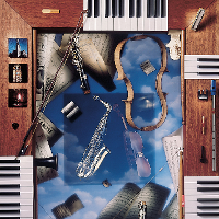
Frasurbane (originally titled '90s Urbane) draws from the breakthroughs made by the 1990s Grunge movement, but filtered through the lens of a more conservative and aging Baby Boomer population that was settling down, becoming more wealthy and suburban. Serif fonts abound, accentuated with underlining, italicization, and various weights. These are usually coupled with warm sepia or black-and-white images of 'timeless'/classical representations of basic concepts (sometimes in a surrealist manner), often in soft-focus and featuring heavily-staged product photography. Astrolabes, globes, 'Vitruvian Man' style diagrams, textured paper, Neo-traditional architecture, relatively 'realistic' drawn representations of various traditional objects, plants, and animals (think Victorian-era scientific illustrations). My understanding is that as postmodernism emerged in the 1970s-80s, it started off as brash, 'Memphis' loud, and morphed into a more traditional, classical, and conservative version of itself as it's progenitors aged and the style became subsumed into popular culture and accepted as a capitalistic upper-class signifier. With the economic recession of the early 1990s, this understated form became even more popular, compatible with both the zeitgeist of an aging population (nostalgic photographic treatments, attempts to appear timeless by including 'classic' versions of objects rather than their then-current 1990s iterations) and the surface environmentalism of the era (earthy warm tones, 'eco-friendly' packaging, naturalistic accents like twine, twigs, wooden crates packed with straw, leaves).