Corporate Memphis
Namesake:
Named for the loose inspiration it takes from 80s designs by the Memphis Milano group, and its general association with graphic design used by major corporations in the 2010s. It is critical to note that the name’s implied association with the Memphis Milano group does not have a strong foundation anymore; the style rarely carries any resemblance to their work. The name did reach popularity in vernacular however, so we’ve deferred to using it on those grounds.
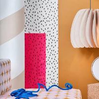
The Generic 10s 'Friendly' Corporate Aesthetic, neo-Memphis, pastel colors, Mondrian influence, corporate appropration of Corporate Vaporwave motifs, geometric sans typefaces, Monstera plants, exposed plywood, white walls, Matisse-influenced graphics.